
Timeframe
January 2021
Job Context
Web Designer / UI Designer
Links
Website (Adobe XD)
Competencies
Artistic – Users Empathy
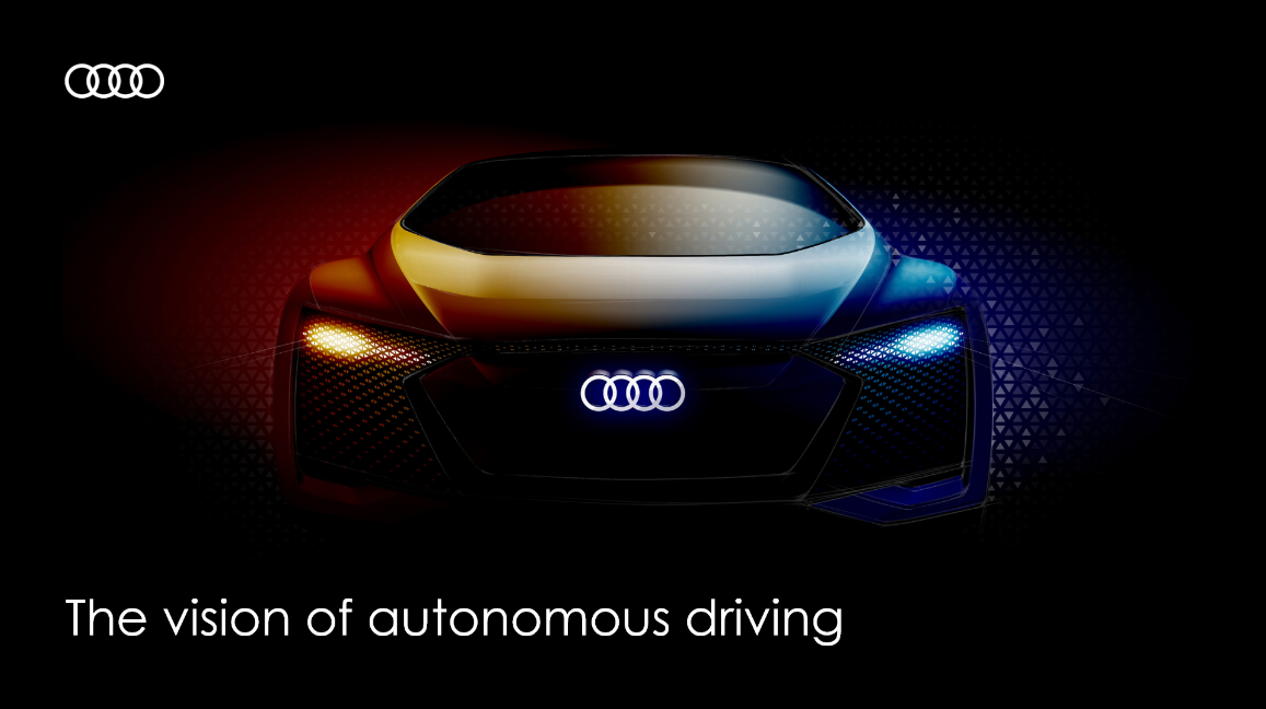
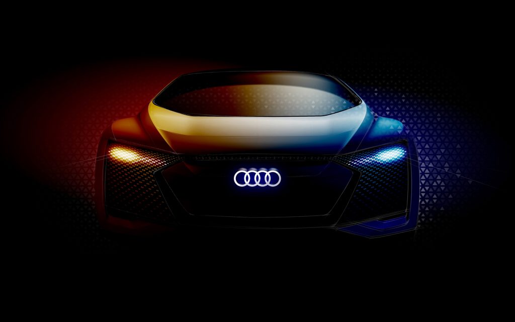
– The Audi logo.
– A strong visual.
– Catchy phrase.
That’s it…
To make the user feel informed about something special and make them curious it is important to use the “less is more” technique that I applied on the landings page!
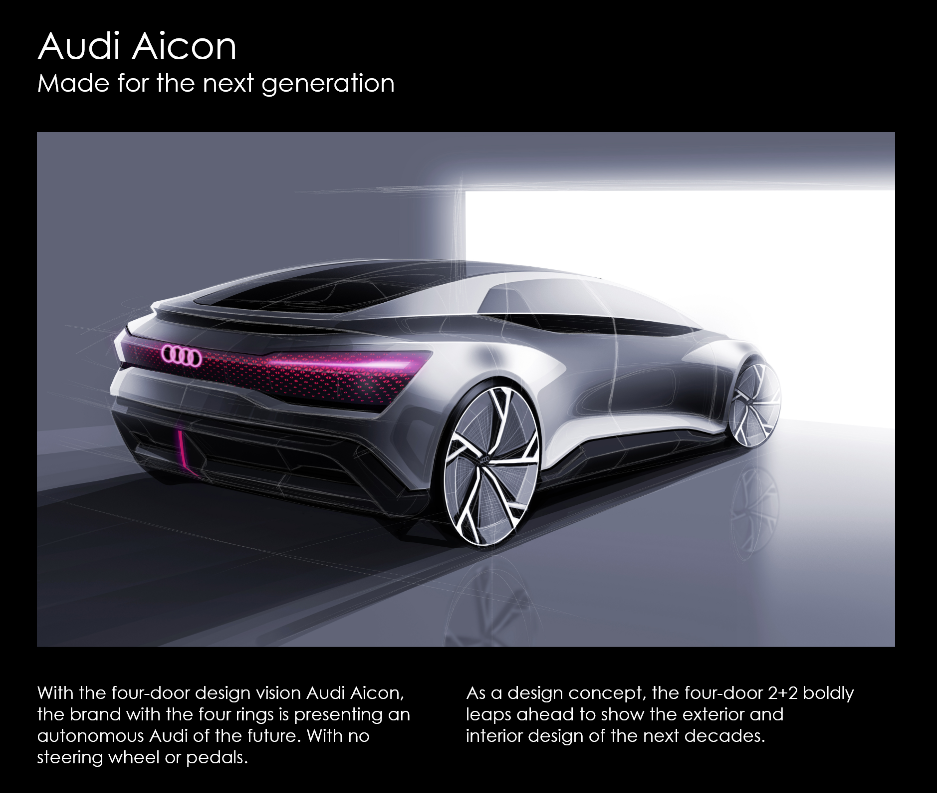
The creation of the website needed the Audi theme and styles. I used their own website as inspiration and all the images/visuals are from Audi themselves.
Again every new viewpoint starts with the H1 followed by a catchy sentence that needs to make the user curious of what to come.
Underneath the visual I used 2 columns for 1 paragraph to fill up the width, this was needed to copy the exact Audi style’s to keep everything consistent.
Here we see the information panel which starts of by some showcases of the concept car.
I used the “long road” visuals to attach the right feeling when reading about distances and the radius.
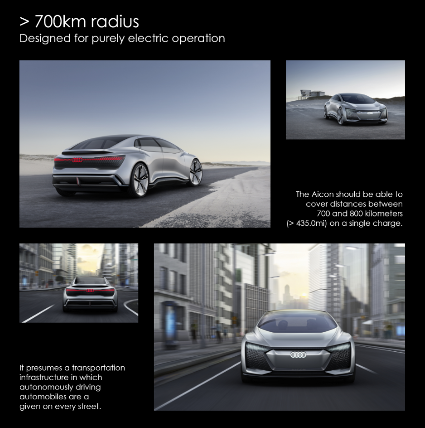
The lower information panel explains the transportation infrastructure and has visuals to keep the same theme applied.
Design-wise I kept it the same as the first row but mirrored the elements to give a more modern/luxury feel to it!
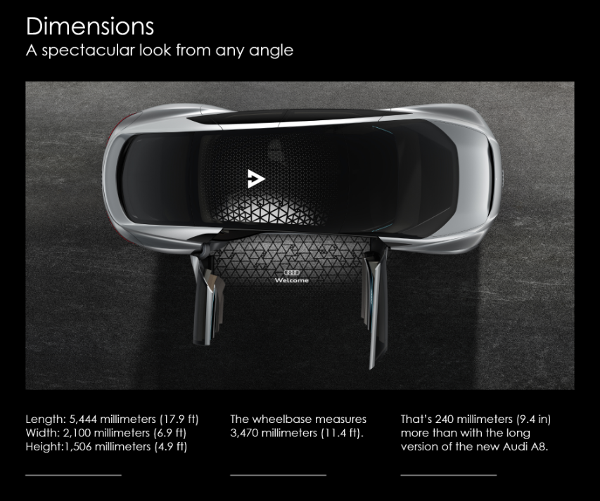
This has to be on of my favorites on the webpage.
The Dimensions viewport!
“Dimensions” shows the user what they want to see regarding the overall dimensions from the car itself. To keep it all theme based you can see I used the visual/column structure again.
3 columns that are aligned to the image and are 33% (equally seperated) makes sure that the user sees more information that is easy to read instead of on big pile of text. The lines underneath are to assure that the user knows they are 3 seperate paragraphs
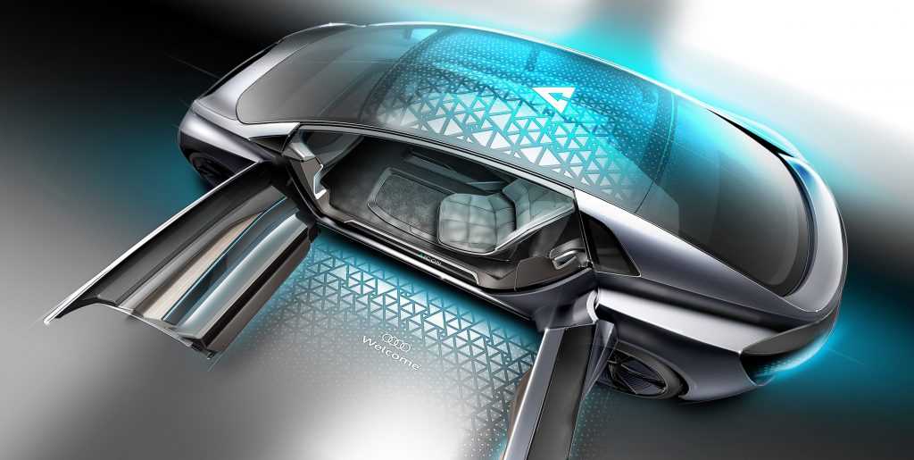
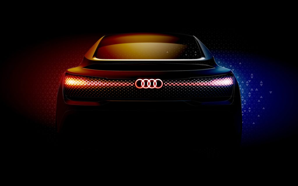
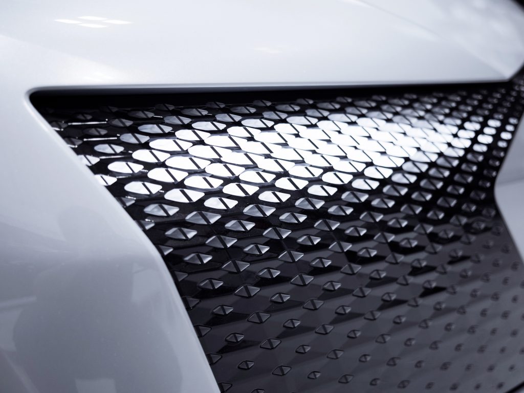
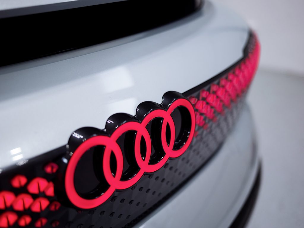
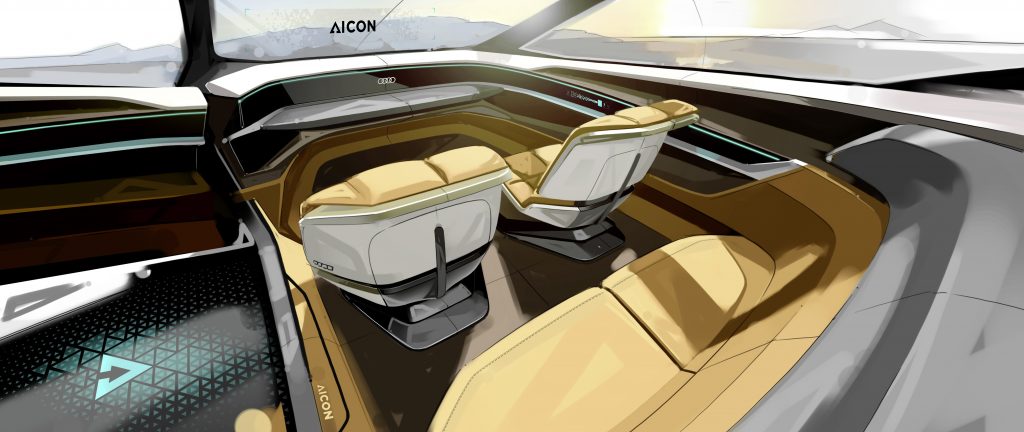
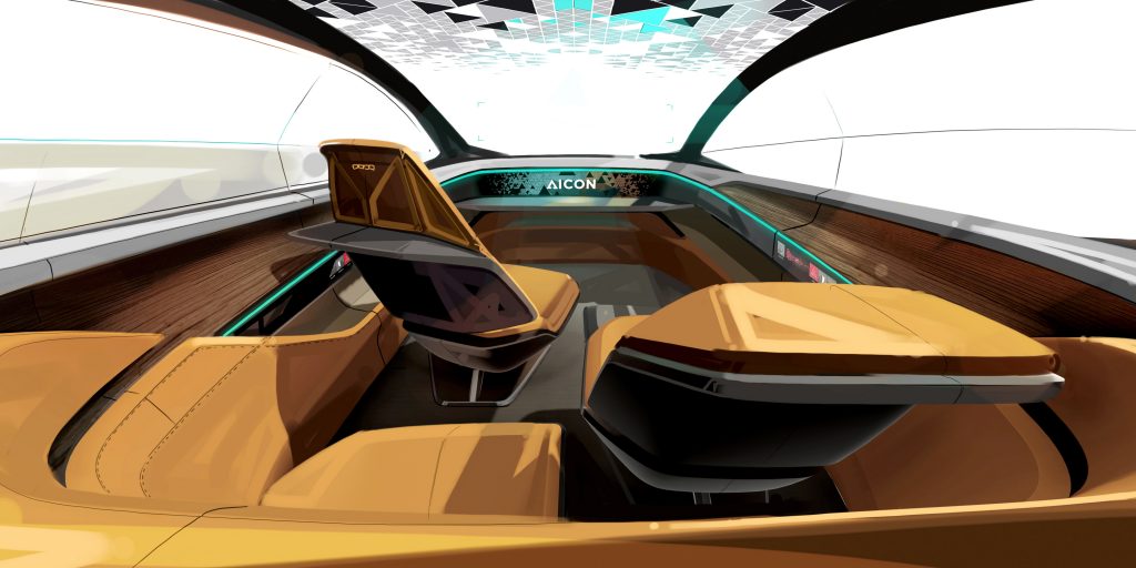
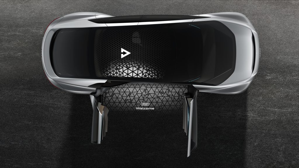
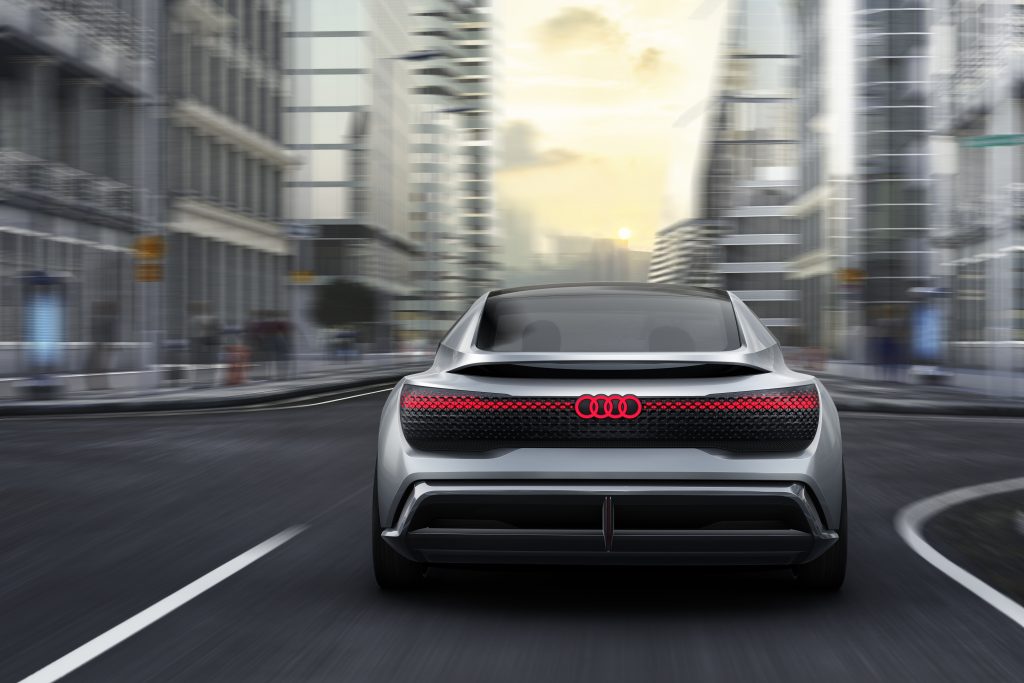
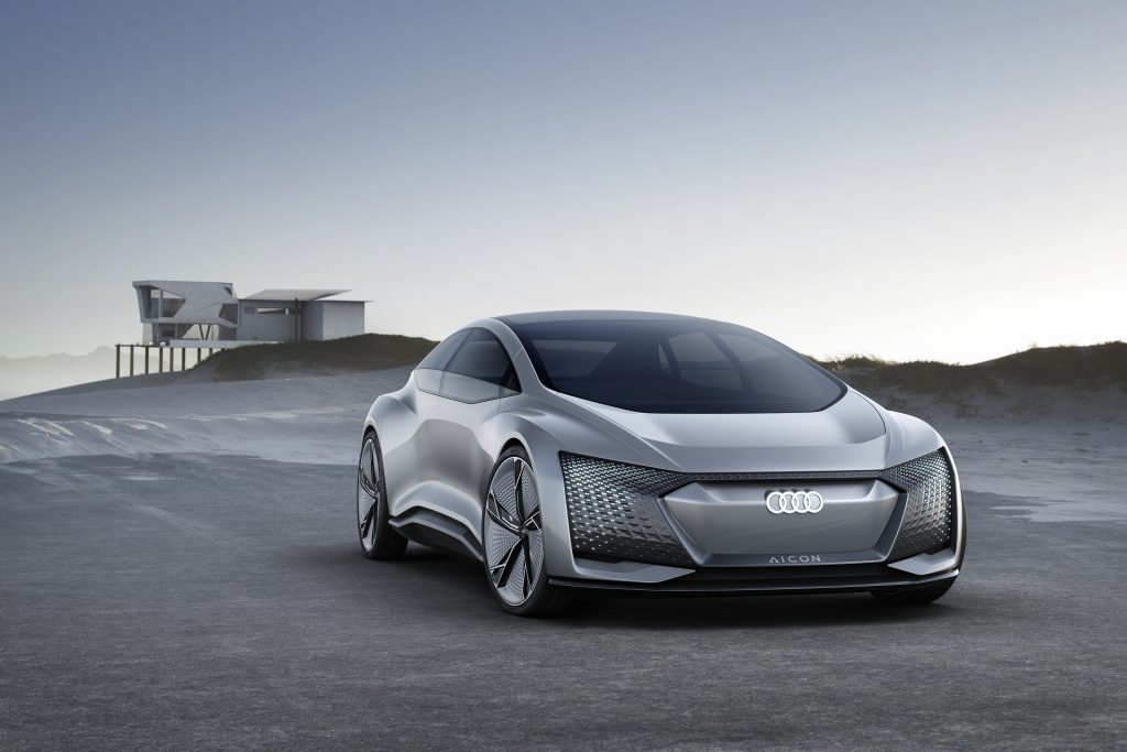
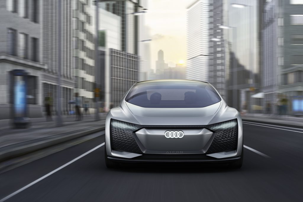
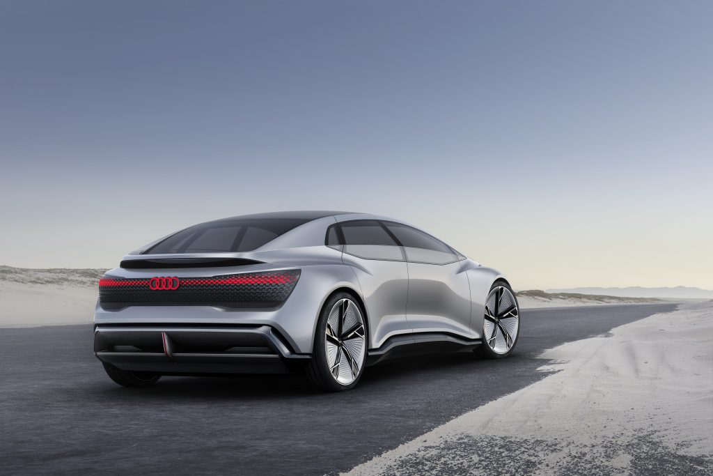
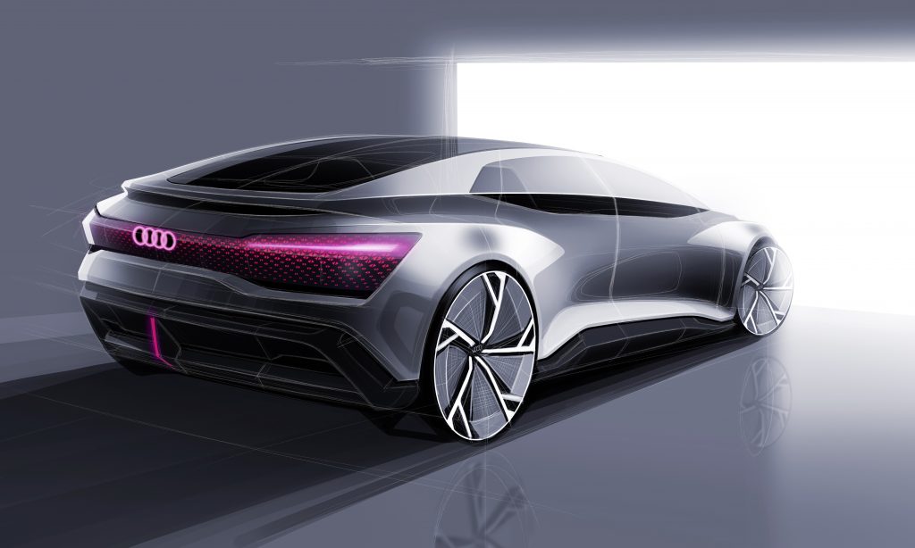
Images that were used on the website

Summary
This project (assigned to myself by myself) was an expirement to discover the possibility of recreating an existing website. However I came to the conclusion that the website for this car did not exist except for a showcase page of the car on the Audi website itself.
With this design experimental project I learned to be consistent, never forget style rules and come up with something that can be “reused” in the creation of the website.
I asked for honest feedback on an online forum and the results were that 95% of them were amazed by the mysterious feeling but the informational structure of the site and the correct use of imagery. I am going to do more of these projects soon!